October 14, 2026
Colorist Spotlight: Inside the Scope
Daff Schneydher is a Colombian senior colorist based in Uruguay, post-production supervisor and digital workflow specialist with more than two decades of experience shaping the visual language of feature films, television series, streaming productions and commercial campaigns. As Head of Color at Colour by Mediapro, he works at the center of creativity and technology, overseeing everything from color grading and HDR mastering to color-managed workflows and other post-production pipelines.
His work has reached audiences through productions for Netflix, Disney+, Amazon Prime Video, HBO Max and Warner Bros. Discovery, as well as campaigns for global brands including Coca-Cola, McDonald's, MTV and Verizon. Beyond the grading suite, Daff is also a passionate educator, regularly teaching color grading and digital workflows while helping shape the next generation of colorists across Latin America.
In this interview, Daff takes us inside his grading suite, shares the tools he relies on every day, and explains how he uses Nobe OmniScope to balance images, maintain consistency across SDR and HDR workflows, and investigate complex color transformations.
"Color doesn't simply make an image more beautiful; it gives it intention, emotion and meaning."
From designing HDR workflows and mastering feature films to teaching the next generation of colorists, Daff Schneydher believes great color grading begins with understanding the story.
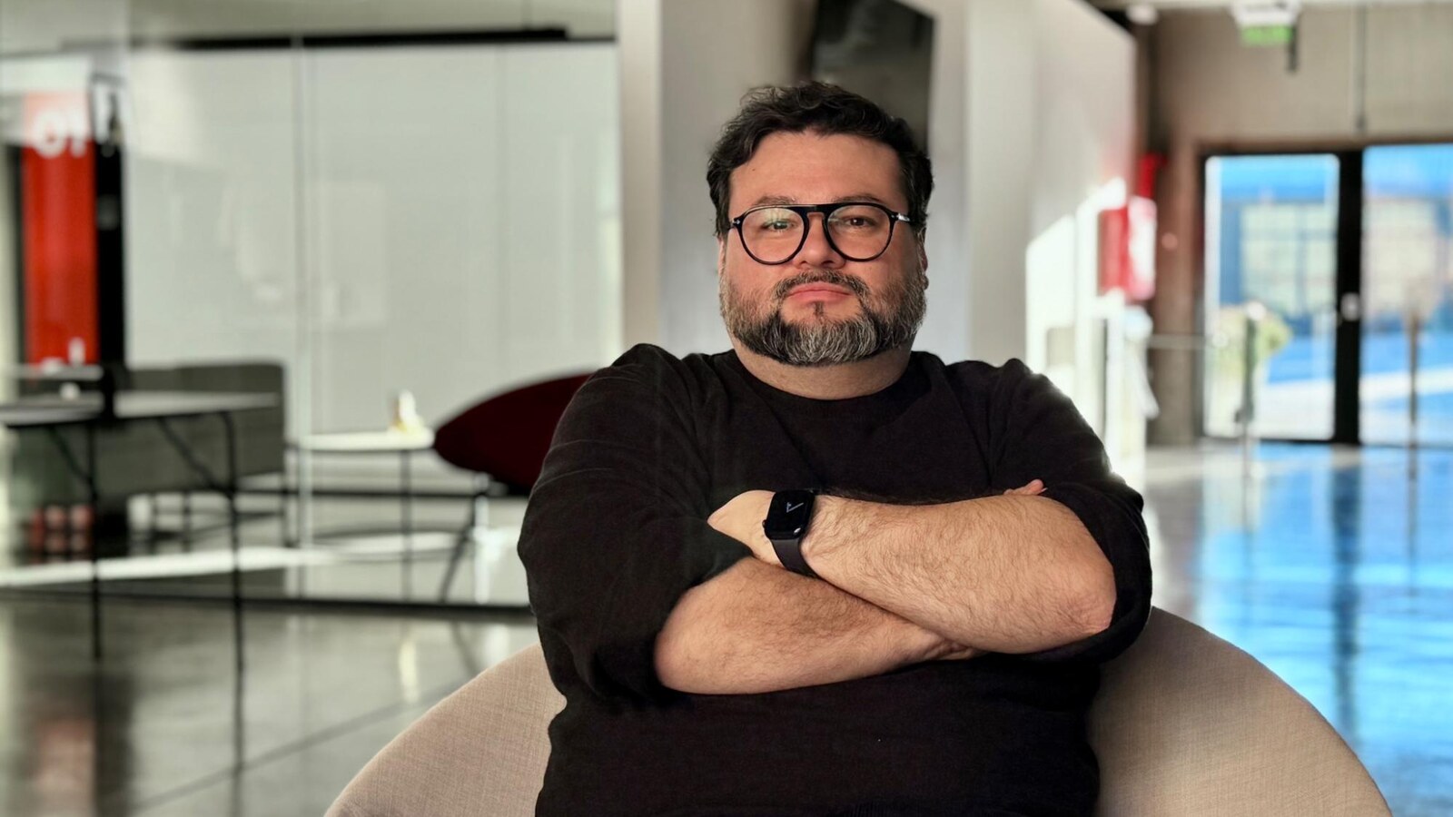
I've spent more than two decades working across different areas of post-production, from compositing and animation to feature films, television, streaming productions and commercial campaigns. Today, as Head of Color at Colour by Mediapro, my work brings together two areas I consider inseparable: creativity and technology.
Alongside color grading, I'm involved in workflow design, color management, HDR mastering and solving the technical challenges throughout post-production. Teaching color grading and digital workflows is also an important part of my career. I enjoy sharing what I've learned while continuing to learn from others.
Today, I define myself primarily as a colorist who connects the creative and technical sides of the process. I believe it's important to understand the rules, tools and boundaries of the canvas on which we work. Once we understand those boundaries, we can move within them with freedom and create wonderful things.
My journey into color grading wasn't a straight line. It evolved naturally from my work in compositing and animation, where I began to understand just how fundamental color is to the construction of an image. Over time, that fascination grew until color became the center of my professional practice.
What attracted me most was its ability to transform the narrative universe of an image. Color doesn't simply make an image more beautiful - it can alter meaning, guide the viewer's attention and create very specific emotions. I find it fascinating that something which often appears so subtle can have such a profound influence on the way we experience a story.
Whatever the project, my approach remains the same: I want to understand the story, respect the cinematography and use color to support the filmmaker's intentions. Sometimes that means a bold, expressive grade; other times, it means knowing when to hold back.
"When the work succeeds, it supports the story without calling attention to itself. If the audience doesn't perceive the grade as a separate element, that's wonderful to me."
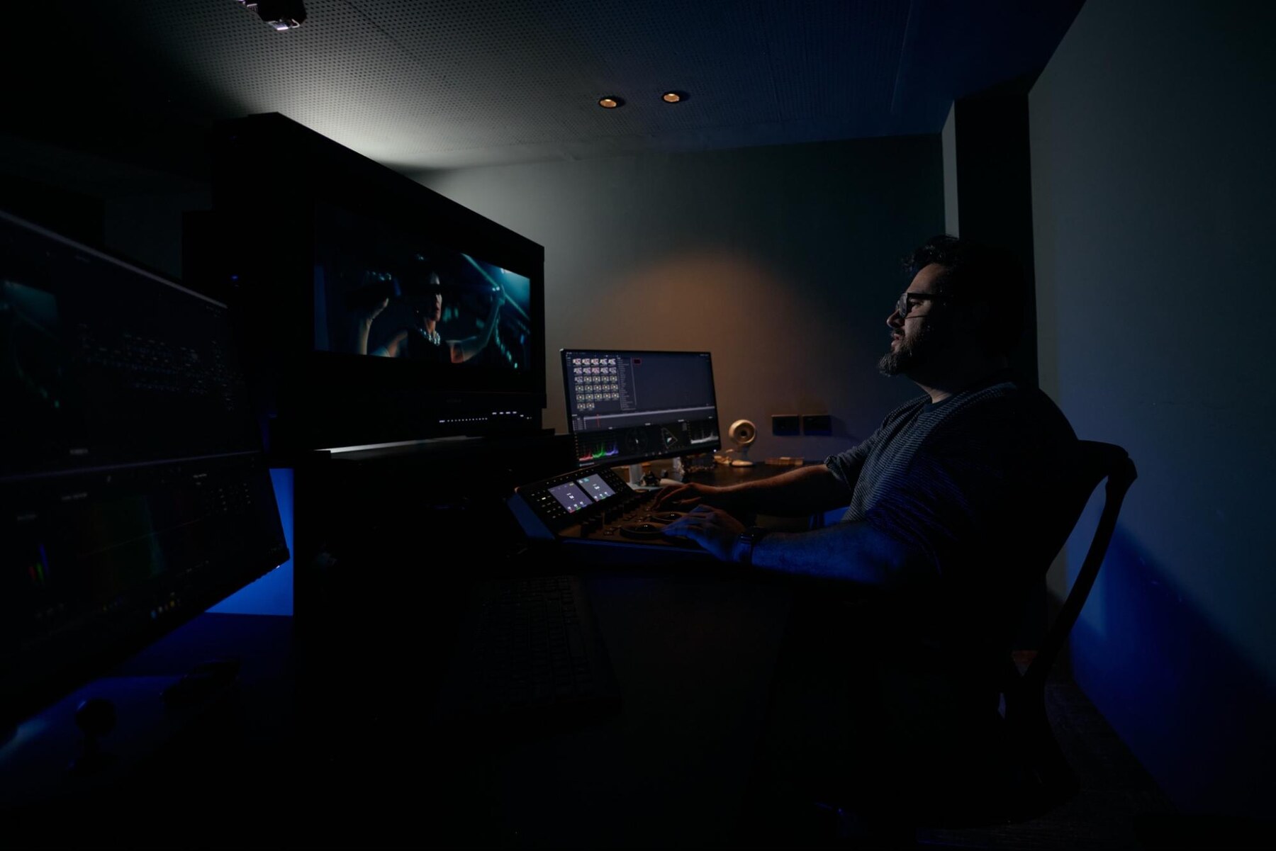 Daff in his grading suite
It's difficult for me to say that I'm prouder of one project than another. Every production has presented its own challenges, and I've learned something from each of them. Rather than ranking projects, I prefer to see them as milestones that have shaped the way I work and understand the profession.
One of the earliest was Historias de diván, the first television series I completed with the person who is now my business partner. Looking back, it was also the project that planted the seed for what would later become Colour by Mediapro.
Early documentaries such as Vigilia: The creation of La Verità, Cuba: Music Revolution and Maracaná were equally important. They introduced our work to local filmmakers and opened the door to many of the collaborations that followed.
Another turning point came with Sentença, my first series for Amazon Prime Video, and Togo, my first feature film for Netflix. Working on both projects at almost the same time gave me the opportunity to fully explore HDR workflows, understand their strengths and develop a complete HDR-SDR pipeline.
On A Bright Future, directed by Lucía Garibaldi, I explored saturation and color density as expressive tools for building the protagonist's emotional world.
Princesa Burro, directed by Cristóbal León and Joaquín Cociña, presented a completely different challenge. The film moves through multiple visual worlds, each with its own logic and identity, while still requiring a coherent visual language that holds the story together.
In the documentary Traslados, directed by Nicolás Gil Lavedra, the responsibility was different again. Working with archival material alongside recreated scenes required every creative decision to respect the historical and emotional weight of the subject matter.
As Head of Color on Belén, directed by Dolores Fonzi and graded by Alejandro Armaleo, my focus shifted beyond the grade itself. Together with my team at Colour, particularly Sebastián Rodríguez, our General Coordinator, and Carmela Marichal, our Transkoder Operator, and in close collaboration with Martín Bendersky, the project's Post-Production Coordinator, we developed a color workflow that preserved the creative intent from production through post-production, supporting both SDR and HDR deliverables. A key part of this process was validating the entire roundtrip using Colorfront Engine. The idea to adopt this technology originally came from Gabo Kerlegand, whose vision and confidence in the approach encouraged us to explore it and ultimately make it work.
Although every project is unique, my approach never really changes. My priority is always to understand the story, respect the cinematography and determine how color can best support the film's visual language.
Large streaming productions naturally introduce more demanding technical specifications and delivery requirements, while independent films often provide greater creative freedom to experiment. But regardless of the scale of the production, my objective remains the same: to preserve the creative intent and serve the story.
My grading room is built around one central principle: creating an environment where I can focus entirely on the image.
At the heart of the suite is a Sony BVM-HX3110 reference monitor, which allows me to work confidently across both SDR and HDR color spaces. Everything else in the room is arranged to support that experience while keeping the tools I need within easy reach.
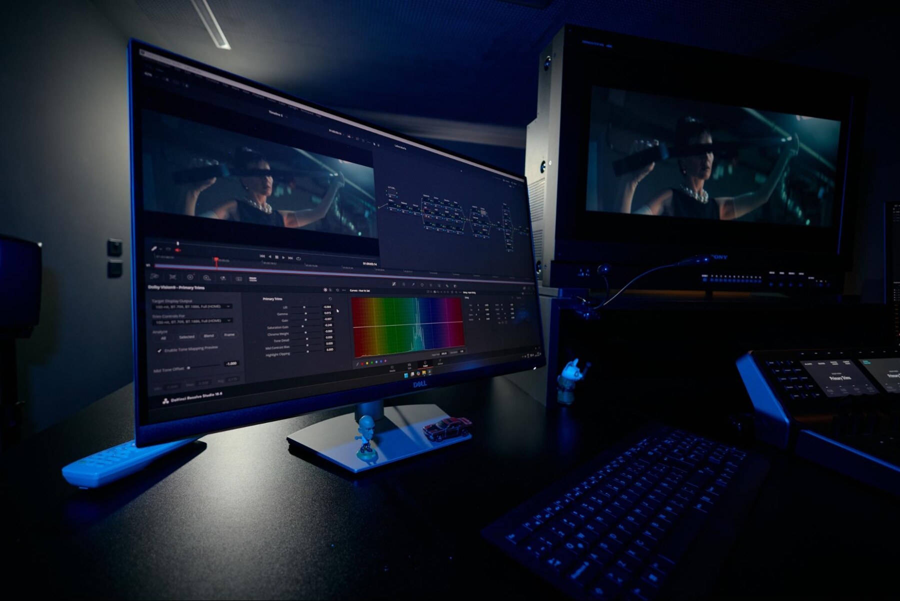
I use DaVinci Resolve 20 as my primary grading application. Although version 21 is now available, I prefer not to make major software changes in the middle of active productions. Stability and continuity are essential, particularly when working on long-form projects with multiple versions and deliverables.
My workstation is built around a Supermicro system connected to Colour by Mediapro's SNS storage server, with video signals distributed over SDI using Blackmagic Design DeckLink 8K cards. Alongside my reference monitor, I use two additional displays for the grading interface, scopes and supporting tools, while a DaVinci Resolve Mini Panel provides tactile control throughout the grading process.
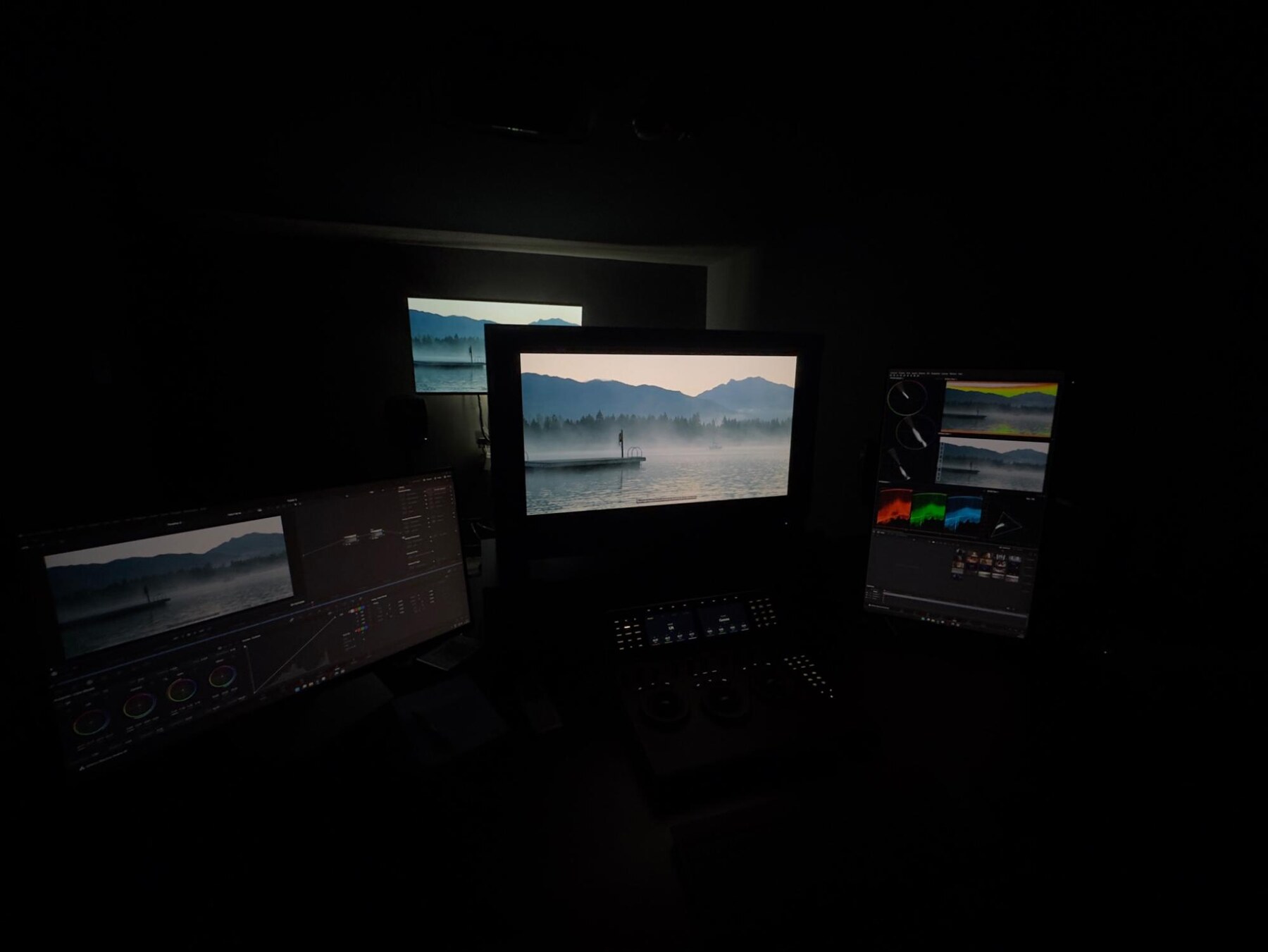 Daff's grading suite
An LG C4 is mounted on the wall as a dedicated client display, receiving its signal through a Blackmagic Design 12G converter. This gives clients a separate viewing experience during sessions. The suite is also equipped with a Genelec 5.1 monitoring system, allowing projects to be reviewed in a complete audiovisual environment.
Every element has been chosen to create a workspace that balances precision, stability and flexibility, whether I'm grading, reviewing with clients or mastering final deliverables.
My choice of plugins depends entirely on the creative needs of each project. FilmBox and Dehancer are tools I often use because they allow us to explore texture and characteristics associated with photochemical images, while Chromatic Adaptation is invaluable for balancing images quickly and accurately.
One workflow I rely on every day is maintaining a fixed node structure. Having a consistent organization allows me to work efficiently, stay organized throughout long-form projects and always know where each operation belongs. The structure itself remains consistent, but every creative decision is shaped by the individual image and the story I'm trying to support.
Before I begin grading, I always watch the film as it was assembled in the edit. My first objective isn't to analyze it technically, but to understand what the director wants to say and what the cinematographer is trying to express. I need to understand the intentions behind the image before I start evaluating it from a technical perspective.
I also spend time discussing the project with the creative team and asking about the references that inspired them. Those references can come from anywhere - a film, a photograph, a painting, a piece of music, a book or even a textile. They aren't there to be copied literally, but to help us build a shared visual language and better understand the emotional world we're trying to create.
Only then do I begin examining elements such as exposure, compression and the characteristics of the source material. Even RAW files can contain compression artifacts, noise or other capture characteristics that need to be recognized before creative decisions are made. This initial assessment helps me distinguish between an intentional photographic choice and a technical limitation.
Scopes play an important role from the very beginning. During the initial balance, I use them to define luminance boundaries and better understand the image before we begin developing the final look.
Once the director, cinematographer and I have established the visual direction, the scopes become a constant point of reference. They help me compare shots and scenes, identify subtle deviations and ensure that the visual language we've created remains coherent throughout the project.
For me, consistency doesn't mean every image should look the same. Every scene has its own emotional purpose, but they should all feel as though they belong to the same visual universe.
When working with directors and cinematographers, we often push an image very close to its limits. That's where scopes become an invaluable creative partner. They help me understand exactly what's happening within the image and find ways to approach those limits without crossing them.
I don't believe scopes should impose an aesthetic or restrict creative decisions. Their purpose is to provide the information we need to explore confidently while preserving the visual intention within a technically sound workflow.
"For colorists learning the craft, my advice is simple: practice connecting what you see with what the scopes reveal."
Over time, that relationship becomes intuitive. Scopes don't replace your eyes or make creative decisions for you - they complement your vision, helping you understand, confirm and repeat the choices you make.
I first discovered Nobe OmniScope several years ago while exploring NDI as a way to transmit and monitor video signals remotely. What began as a practical solution quickly became an integral part of my grading workflow.
The first thing that stood out to me wasn't simply the number of scopes it offered, but the clarity of the information it presents. During a grading session, I need to understand what's happening in the image immediately, without the tools themselves becoming a distraction.
Today, OmniScope is part of every project I work on, whether I'm grading locally or remotely. I use it during the initial balancing of the image, to define luminance limits and establish visual references. Once the look has been developed, it becomes an essential tool for maintaining consistency between shots and scenes.
I work with two primary layouts - one for SDR and another for HDR - allowing me to move seamlessly between different mastering environments while always having the information most relevant to each workflow.
The Waveform and Skin Tone Monitor are the tools I rely on most, alongside Grayscale, False Color, Zonal Vectorscope and the CIE Chart. Being able to customize both the layout and the information on screen means I can focus on exactly what I need for each stage of the grading process.
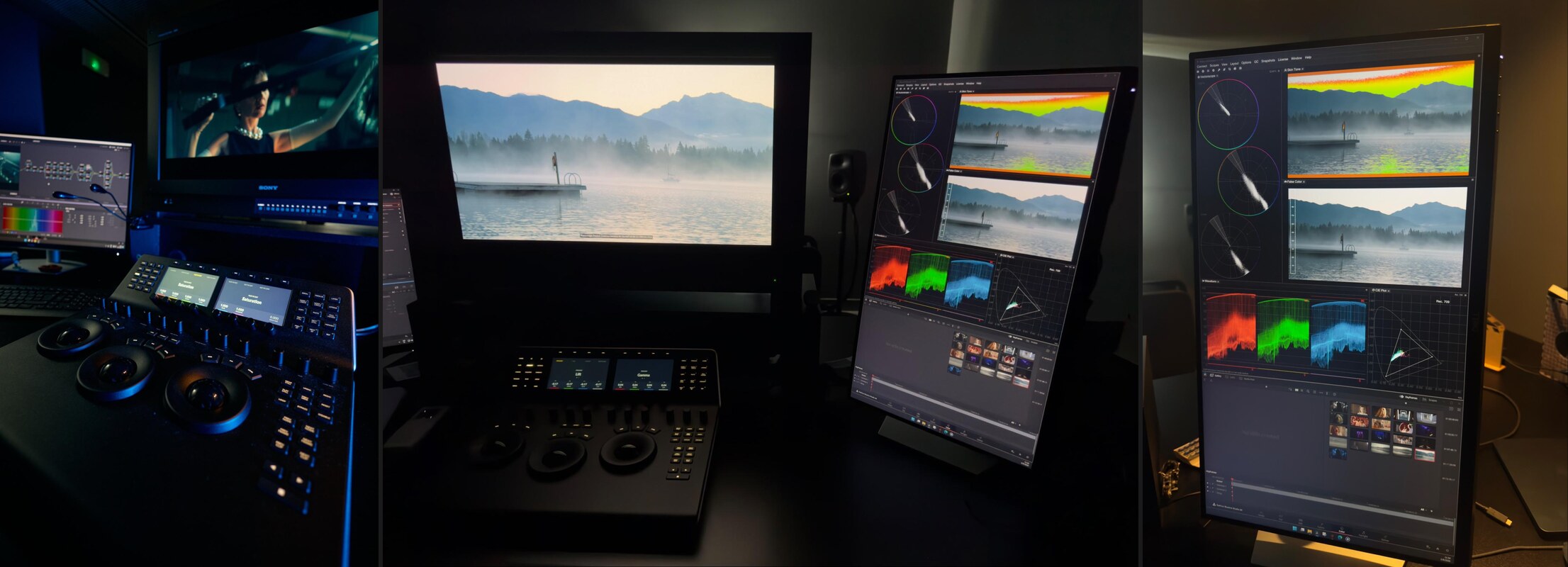 Nobe OmniScope in Daff's suite
I don't see OmniScope as replacing the scopes inside DaVinci Resolve. Instead, the two complement one another. OmniScope provides a personalized, permanently visible workspace, while Resolve remains at the center of the grading process. Together, they give me immediate access to the information I need without interrupting the creative flow.
One project that significantly shaped the way I think about workflows came when we began exploring Colorfront Engine as the foundation for a new color pipeline.
During that process, OmniScope became much more than a verification tool. It allowed me to precisely compare the LUTs we were creating with the transforms performed in Transkoder, helping me understand the behavior of each transformation and design LUTs that made full use of Colorfront technology.
In that situation, the scopes weren't simply confirming the final image. They became an essential part of understanding the system itself, allowing me to build a workflow that remained technically robust while preserving the project's creative intent.
Deadlines are almost always tight in post-production, so organization becomes just as important as technical skill. I try to build every schedule with enough flexibility that unexpected challenges don't immediately affect the entire production. Good preparation, a clear workflow and constant communication allow us to spend our time solving creative problems rather than avoidable technical ones.
Quality doesn't depend only on having more time. Whenever possible, I also like to become involved during pre-production, particularly during look development and LUT creation. Establishing the visual language early allows cinematography, production design and costume design to evolve around the same creative vision. It also gives us the opportunity to solve potential issues during testing, rather than trying to fix them later in post-production.
One habit that has saved me countless hours over the years is maintaining a fixed node structure and a consistent project organization. A familiar framework means I always know where each operation belongs, making it much easier to revisit creative decisions or adapt to changes without rebuilding the entire image pipeline. That consistency becomes especially valuable on long-form productions with multiple versions and deliverables.
Every project teaches me something new because no two productions present exactly the same challenges. That's why I like to begin with a workflow that's flexible enough to respond to different situations.
I often compare it to a Swiss Army knife. At the beginning of a project, I have many possible tools available, even though I'll probably only use a handful of them. The others remain there if I need them.
"The most important lesson I've learned is to prepare for complexity without imposing it."
A good workflow should give you every option you might need, while also giving you the judgment to use only the tools that genuinely serve the image and the story.
Color grading has changed enormously since I first entered the industry. When I began, there were relatively few colorists because systems such as DaVinci and Assimilate Scratch required a significant financial investment.
Today, the tools are far more accessible, allowing many more people to experiment, learn and enter the profession. But while the technology has changed, the essence of the work hasn't. Understanding photography, light, narrative and communication remains just as important as ever.
One of the biggest developments has been the rise of HDR and streaming workflows. HDR has expanded the creative possibilities of the image while also encouraging more rigorous approaches to color management, monitoring and delivery. In many ways, its greatest contribution has been the discipline and methodology it has brought to the grading process.
Remote collaboration has also become an important part of the profession. It has made review sessions faster and more flexible, but it also presents new challenges. I don't always know the conditions in which someone is viewing the image or how their monitor is configured, so successful remote grading depends as much on communication as it does on technology.
In fact, I believe communication is the greatest challenge facing colorists today. Understanding what story the director and cinematographer want to tell is only part of the process. The real challenge is understanding what they want the audience to feel, and how the image can help create that emotion.
Every project requires us to build a shared creative language. Technology can make collaboration faster, particularly when working remotely, but it can never replace clear communication or a common understanding of the creative vision.
"For anyone starting a career in color grading, my advice is simple: develop order and method, but above all, learn how to observe."
Before trying to recreate a particular look or master another piece of software, spend time understanding photography and light. Watch how color, contrast and illumination change throughout the day, and learn how those subtle variations influence the way we perceive an image. Software is important, but it is only a tool. Observation, sensitivity and the ability to understand a story are what ultimately lead to good creative decisions.
What I enjoy most about this profession is telling stories. I love exploring how an image can be transformed and seeing how color can shape emotion. Just as importantly, I enjoy the collaborative process of working with directors and cinematographers to build a coherent visual universe.
When color supports the story, creates an emotional response and does so without drawing attention to itself, I feel the work has achieved exactly what it was meant to do.
Favorite film visually: It's difficult to choose just one. Amélie is a wonderful example of color being used as a storytelling tool, while O Brother, Where Art Thou? shows how color can define an entire atmosphere. I also love the color palettes in Pedro Almodóvar's films, where color becomes part of the characters and the narrative itself. The same is true of Wes Anderson's work, whose distinctive visual style creates worlds that are instantly recognizable.
Favorite cinematographer: There are so many that it's impossible to choose just one. Roger Deakins and Emmanuel "Chivo" Lubezki have both been a huge source of inspiration throughout my career. I've also had the privilege of working with César Charlone, whose sensitivity and approach to image-making left a lasting impression on me.
I'd also mention Germán Nocella. Beyond being my business partner, he's an exceptional cinematographer, and working together over many years has taught me a great deal about visual storytelling, collaboration and the importance of developing a shared creative language between cinematographer and colorist.
Most underrated tool in your grading suite: I don't think there's such a thing as an underrated tool. Every tool has its purpose when it's used to solve the right problem.
Go-to visual reference when grading: I don't have a single reference that I return to for every project. Instead, I prefer to develop references through conversations with the director and cinematographer. Every story has its own visual universe, and the references should emerge naturally from that creative dialogue.
One tool you couldn't live without: The Waveform and RGB Parade. My eyes make the creative decisions, but these scopes give me the technical confidence to understand luminance, evaluate balance and maintain consistency throughout the grade.
A project you wish you had graded: Anything from Star Wars.







