May 11, 2026
Colorist Spotlight: Inside the Scope
There's a moment Hootan Haghshenas chases in every project - the one where the image finally clicks. Where the colour stops being something you notice and starts being something you feel.
With over 15 years in post-production, 185+ credits, and work spanning Netflix originals, Disney+ productions, and an Academy Award-winning feature, Hootan has built a reputation as one of Melbourne's most trusted colourists and Technical Directors. He operates at the intersection of technical precision and genuine storytelling instinct, which is the kind of person a director calls when the image really matters.
His work ranges from VFX-heavy HDR episodes to films built on five shots across two and a half hours. Whatever the project, his question is always the same: does this serve the story?
Let's hear Hootan talk about workflow, tools, and what 185 films teaches you about colour and patience.
Meet Hootan Haghshenas: colourist, Technical Director, and one of the most quietly impressive image-makers working in post-production today.
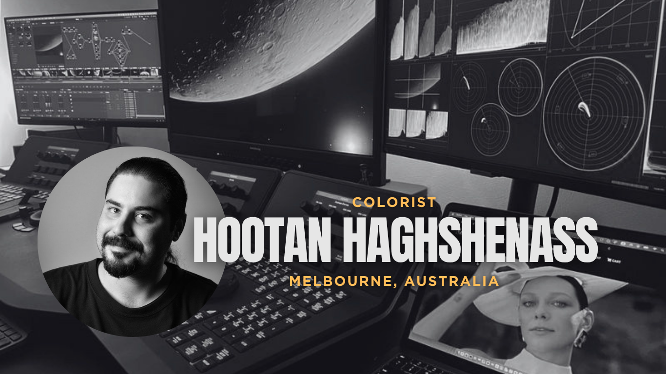
I'm a colourist and Technical Director based in Melbourne - and I've spent the last 15 years doing something I genuinely love: shaping how an audience feels.
Not just how an image looks. How it feels. That balance between technical precision and storytelling sits at the core of everything I do.
It started with cinematography. One of my lecturers, a highly respected cinematographer, had his own editing studio and was starting to explore digital grading. He invited me in, and that was my first hands-on time with tools like Apple Colour, which sparked something.
From there I moved gradually into professional environments, working with larger post-production teams, and developing my skills further, eventually transitioning into a full-time colourist role. Today, more than 185 feature films, series, and documentaries later, I mainly focus on long-form work. The kind of projects that tend to come with complex workflows, VFX-heavy timelines, HDR delivery, while managing multiple formats across platforms.
I don't impose a fixed style. Every project is different, and my job is to adapt to the story and the director's vision. That said, people tend to recognise something in my work: a refined, cinematic quality. Something that feels natural, but still has depth and character.
I'm drawn to projects with a strong visual identity. The ones where colour isn't just supporting the image, but actively shaping mood and tone. Those are the projects that get me excited.
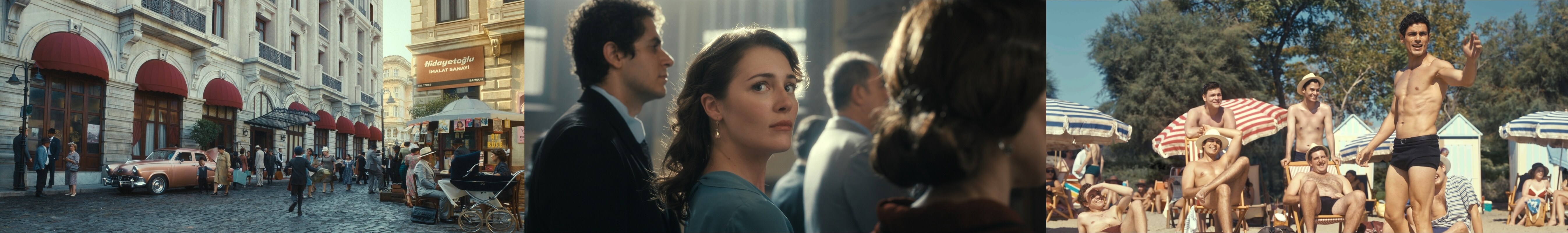
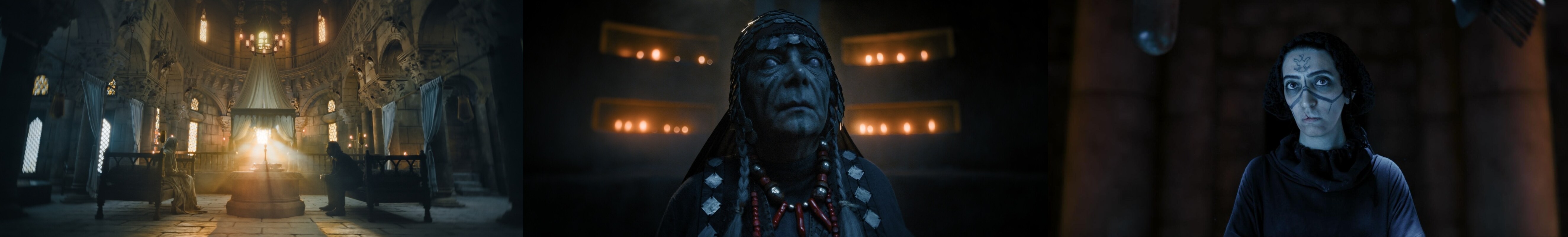
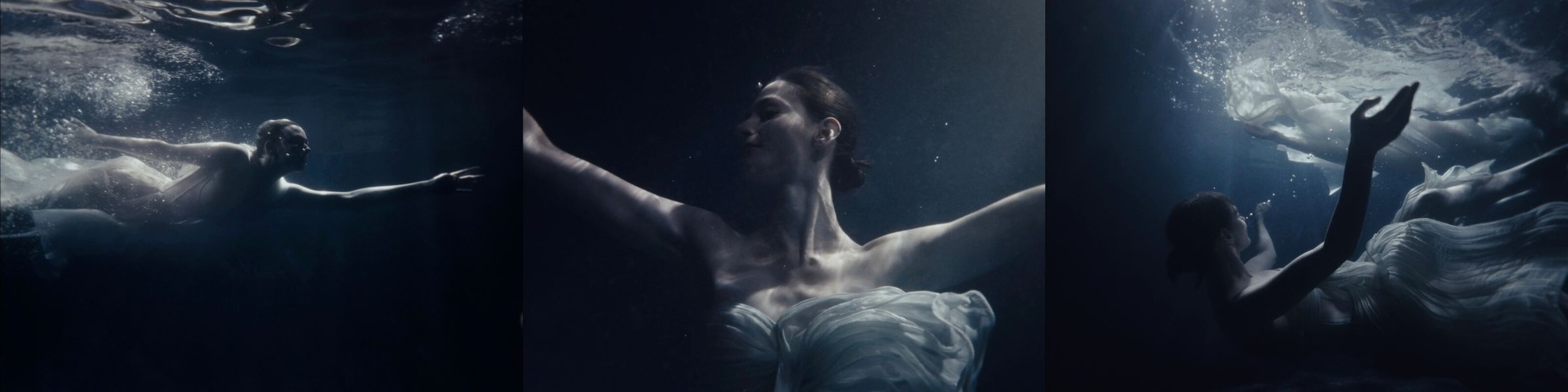 TIDE: Echoes of the Deep
I've been fortunate to work on a range of projects that have been both technically challenging and creatively rewarding.
One significant earlier project was The Salesman, directed by Asghar Farhadi. Being part of a film that went on to win the Academy Award for Best Foreign Language Film was a defining experience, and it reinforced the importance of subtle, story-driven colour work.
A more recent project was Lefter, The Story of Ordinaries, a Netflix feature with over 900 VFX shots, finished in HDR. It required a very high level of quality control and constant supervision, especially as the project was completed remotely. Managing that scale, both technically and creatively, was demanding, but also incredibly rewarding. I had the pleasure of collaborating on the project with my old friend and wonderful post producer, Fatih Dagli, whose support and experience were invaluable throughout the process.
Another standout project is Black Rabbit, White Rabbit, built around extremely long takes. The entire film consists of just five or six shots across roughly two and a half hours. That created a very different challenge, maintaining continuity and shaping the image over long durations, while working closely with the VFX team.
I also worked on Ethos Season 2 for Netflix. Collaborating with writer and director Berkun Oya is always a great experience. There's a strong level of trust and depth in those creative conversations, which allows the colour work to become fully embedded in the storytelling.
More broadly, I don't think there's a single project that defines my approach. Each one brings its own challenges, and I always try to find the right workflow and visual language for that specific story.
More recently, I've been exploring a slightly different way of grading in DaVinci Resolve - one that aligns more closely with how we perceive images. It's still evolving, but it's already shaping how I think about colour and image structure.
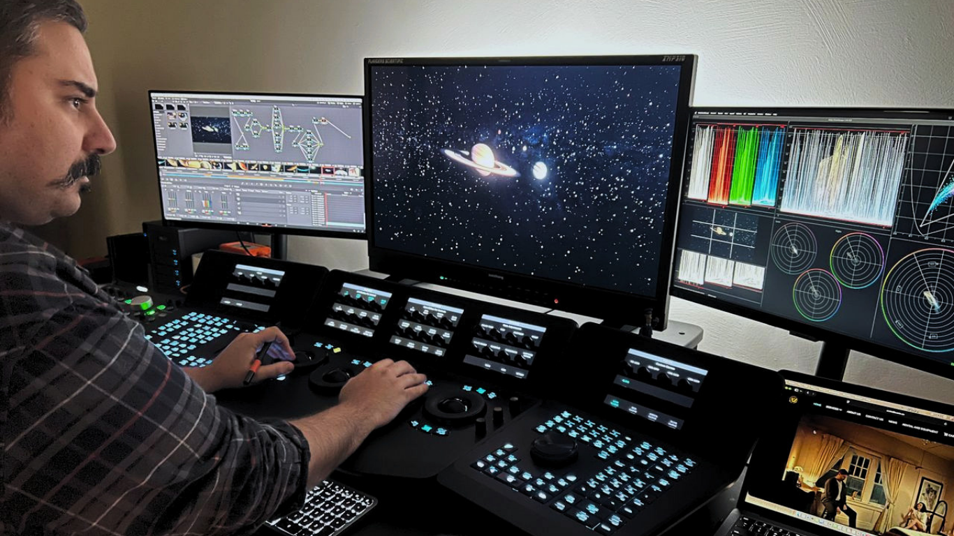
I work in a controlled grading environment designed for consistency and accuracy. The room is neutral, with calibrated lighting, so I can trust what I'm seeing across different displays and delivery formats.
My primary tool is DaVinci Resolve, which sits at the centre of both my grading and finishing workflow. I'm also familiar with Baselight and Adobe tools when needed, but Resolve is where I'm fastest, especially when handling complex timelines and high-end delivery.
For monitoring, I use the Flanders Scientific XMP320 as my reference display for accurate evaluation. Alongside that, I have a client monitor when needed.
For control, I work with Blackmagic Advanced Panels. There's something about the tactile quality of physical control that makes the process more intuitive - especially when you're working through large volumes of material.
In terms of tools, I mostly rely on Resolve's native features. They're incredibly powerful. I'll occasionally bring in plugins for film emulation, grain, or texture - but only when it serves the project. I prefer to build looks from the ground up wherever possible.
Scopes are a constant reference point in my workflow. They help keep things objective - especially when making decisions around exposure, contrast, and colour balance.
I mainly rely on:
But here's the thing: I never let scopes make the final call. They support what I'm seeing. The final judgement is always visual.
When evaluating an image, I start with balance, exposure, contrast, colour separation. I want the image to feel grounded before moving into creative decisions.
Skin tones are always a priority. From there, I look at how colours interact across the frame and whether there's enough depth and separation.
And then the real question: does this support the story?
Technical accuracy is the foundation, but creativity is where it comes to life. And sometimes, breaking the rules is exactly what the image needs.
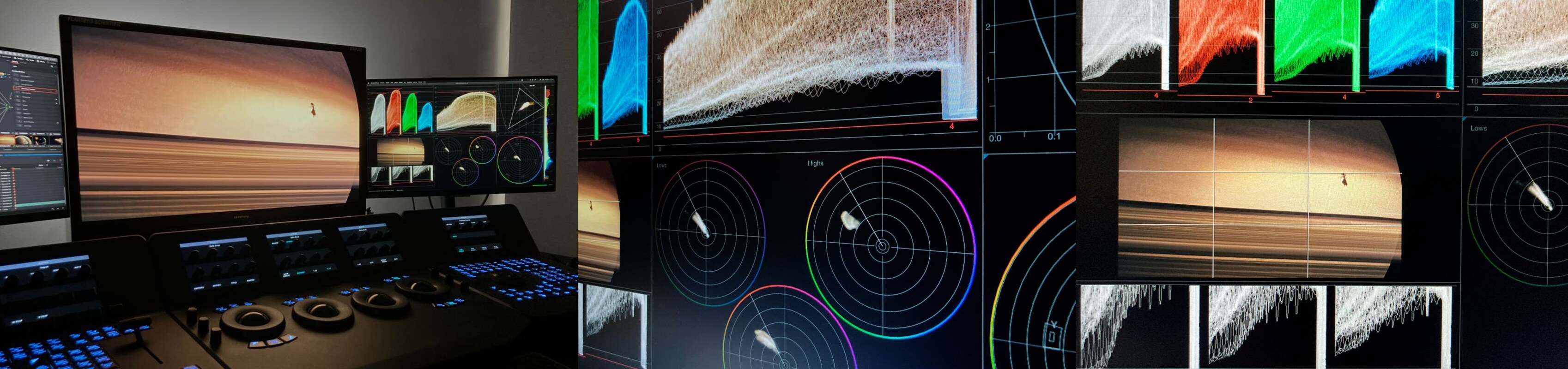
I first came across OmniScope when I joined a studio where it was already part of the setup. It was introduced to me as a more flexible and detailed way of analysing the image - and that description turned out to be accurate.
Today it sits alongside my main grading tools as an additional layer of analysis. I still use Resolve's native scopes every single day. But OmniScope gives me something extra, particularly on HDR projects where the margin for error gets very small very quickly.
The zoomed RGB parade is one of my most-used features. When you're doing precise evaluation of black levels and highlights in HDR, that level of detail matters. The gamut warning and QC tools are also key. They help me catch potential issues early, before they become problems at delivery.
For me, OmniScope doesn't replace anything. It enhances everything. It gives me a more targeted, flexible way to analyse and validate the image.
On HDR projects, quality control becomes a critical stage, and that's where tools like OmniScope really come into play.
Before delivery, I'll run a full QC pass: out-of-gamut colours, brightness peaks, inconsistencies across the timeline. The HDR QC tools make this significantly more efficient. Could I do some of this with native tools alone? Yes. But having that extra layer of analysis gives me a different level of confidence in the final result.
It's less about fixing obvious problems and more about making sure nothing slips through unnoticed, while maintaining consistency at a very high level.
One of the biggest challenges today is balancing technical complexity with creative intent.
Workflows are becoming more demanding with HDR, multiple formats, tighter timelines, but the expectation is still to deliver something that feels refined and emotionally right.
Communication is also a big part of the job. Making sure everyone is aligned creatively can be just as important as the grading itself.
Advice for someone starting out:
Focus on the fundamentals. Exposure, contrast, colour balance. Train your eye. Study films, photography - understand why something works, not just how to recreate it.
And be patient. This is something that develops over time. Every project teaches you something new.
What I enjoy most is that moment when everything clicks, when the image truly supports the story. And the collaboration that gets you there.
Collaboration is central to my process.
It begins with understanding both the technical and emotional intent of the project through early conversations with the director and cinematographer. In these initial discussions, we gather and review references such as images, photographs, stills from other films, and any visual material that helps align everyone's vision onto the same page. From there, we collaboratively determine the most suitable technical workflow. Every workflow has its own advantages and limitations, so the goal is to choose one that best supports the creative intent while minimising friction across the team. Efficiency and clarity are always appreciated in a busy production environment. As I often work remotely, these initial conversations become even more critical, because distance can sometimes lead to ideas being lost, overlooked, or compromised if they are not clearly established from the beginning.
For look development, I prefer to work with material that closely reflects the final conditions, using tests from actual scenes with the intended lighting, lenses, costumes, and makeup. While reference images are invaluable for guiding direction, they do not always translate directly to the final footage, as many variables come into play, such as lighting setups, lens characteristics, costume design, makeup, and the actors' skin tones. That is why many projects benefit from dedicated test shoots, allowing us to refine both the look and the workflow before production begins. Throughout this process, I work closely with the DIT to ensure that what is captured on set aligns with our intended pipeline and that the material delivered to editorial is accurate and reliable.
Favourite film visually: O Brother, Where Art Thou? - for its pioneering digital grade and Roger Deakins' work. More recently, Ripley - for its striking black-and-white and tonal control.
Go-to reference: Photography and paintings - supported by a large personal reference library built over time.
One tool you couldn't live without: Colour Warper tool in DaVinci Resolve.