April 15, 2025
OmniScope Featured Artist:
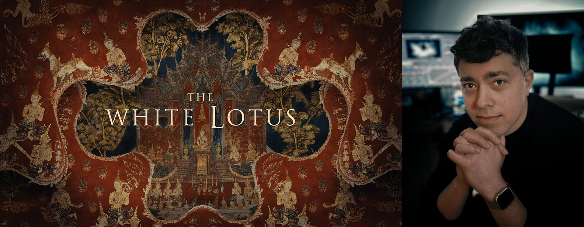
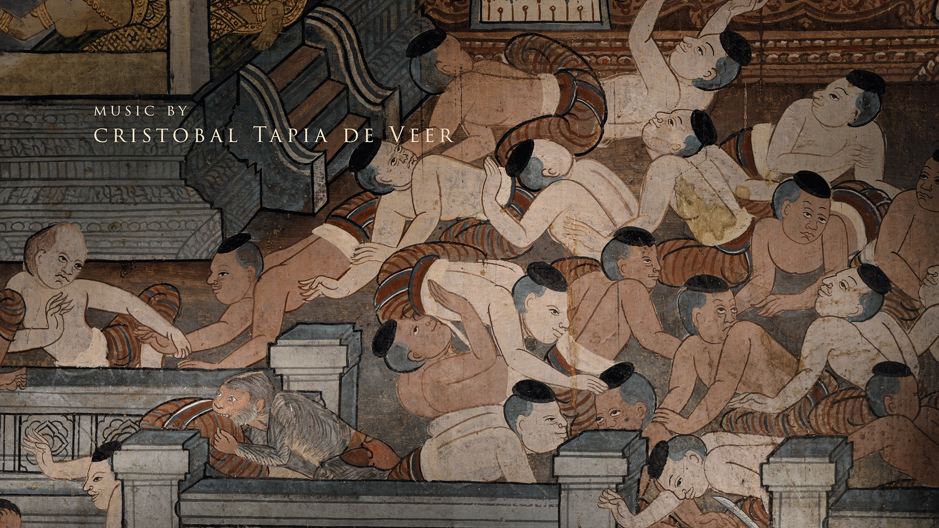
When HBO's The White Lotus returned for its highly anticipated third season, the opening title sequence once again delivered a lush, unique visual experience drawing inspiration from ancient temple imagery in Thailand. To bring the piece together, creative studio Plains of Yonder tapped Los Angeles based colorist Jeremy Stuart.
With a background in motion design, animation, and creative direction, Jeremy brings a unique hybrid skillset to color—especially in title sequences that require both technical finesse and artistic sensitivity.
We recently spoke to Jeremy about his path into color grading, recent high-profile work, and the tools that power his workflow.
Hi Jeremy! Please tell us a little bit about your background.
"Hi! I'm Jeremy, a freelance colorist living in Los Angeles. I was born in Chicago but grew up mostly just north of the city, in the neighborhoods you see in a lot of John Hughes films.
I have two much older brothers (I was an accident), and they were both really into movies. So I ended up watching a lot of wild stuff at what would definitely be considered inappropriate for my age. I saw Indiana Jones and the Temple of Doom and parts of The Exorcist before I was even five!
Then one of my brothers went to film school and used me as an "actor" in some of his projects. This really cemented my fascination with the tools and the playful, DIY process of low-budget filmmaking. By the time I was 11 or 12, I was messing around with pirated photo editing software, just having fun. So I was already heading in this direction long before I had any real idea where it might lead."
You've had a career as an animator and creative director. How did you get started in color grading?
"I got an early start in post, but my path into color was long and fairly unconventional. Before I went to film school, I managed to get a runner/internship position at Optimus, a commercial edit and post house in Chicago. I had no idea what I was doing, but I knew enough Photoshop to be useful, so they kept me around. I ended up splitting my time between working there and studying at Columbia College. I was basically doing both full-time for four years.
At Optimus, I got to see how the entire traditional commercial post process worked. I was interested in color even then, but there wasn't room in that department. There was, however, an opening in graphics. This was right around the time the industry was beginning to shift away from big, expensive Flame suites. So I got into After Effects and ended up helping start the motion design department.
After graduating, I went freelance and bounced around different studios for a few years, eventually landing at Digital Kitchen. There I got more exposure to entertainment and title design work, and to working with a design studio mindset. No strict departments, just a group of artists with different strengths figuring things out together. We did everything from design to directing live-action. At one point, because of some last-minute edit changes to a commercial, I had to match color on a few shots that had originally been graded by a colorist at a big post house. When I pulled that off, it opened the door to doing more color work in-house. And from that point on, I started getting asked to do it more often, which I loved.
Eventually I went back to freelancing, now with a lot more experience, and started taking on a wide range of roles including creative direction, motion design, compositing, live-action directing, and more and more color. Color felt more exciting, more sustainable. I felt that it was something I could really grow into over time. It took several years to get to the point where I was doing color full-time. And working entirely remotely only really became possible at the start of the pandemic."
We loved this season of The White Lotus. How did you get involved in season three's title opening?
"I was brought on by Plains of Yonder, a small studio based in Seattle run by Katrina Crawford and Mark Bashore, who are the creative team behind all the White Lotus openings, as well as a lot of other beautiful title work. I'd worked with Mark and their executive producer Paul Williamson during my time at Digital Kitchen, and I've collaborated with them at POY several times since."
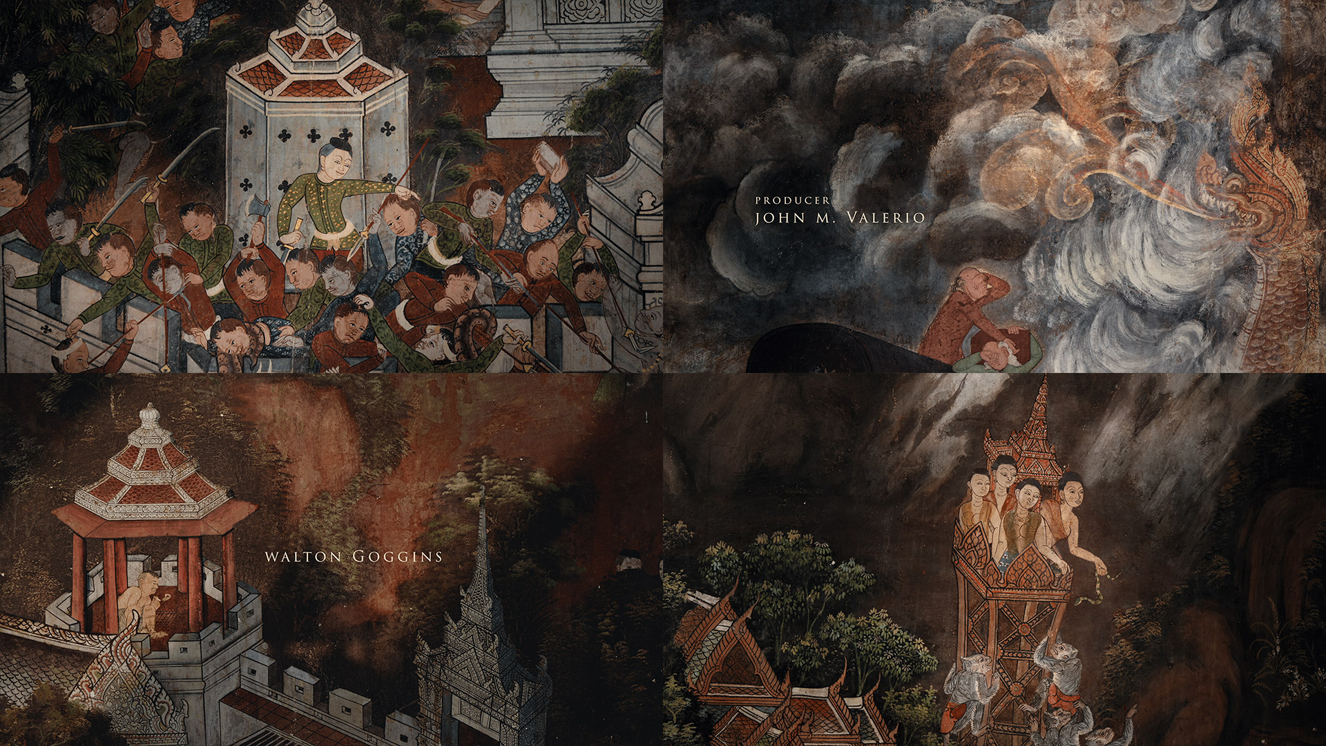
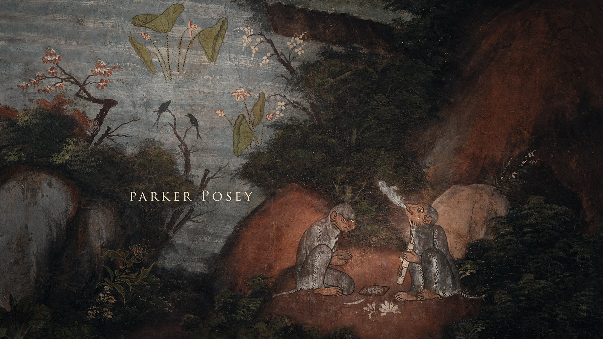
"They created the concept, directed, and edited the piece. They captured a lot of raw artwork at temples in Thailand, then worked with illustrators and compositors to build out the larger fresco-style scenes. From there, they crafted a story arc that echoes the season and adds subtle context to each character's situation… much of which becomes more apparent as the show unfolds.
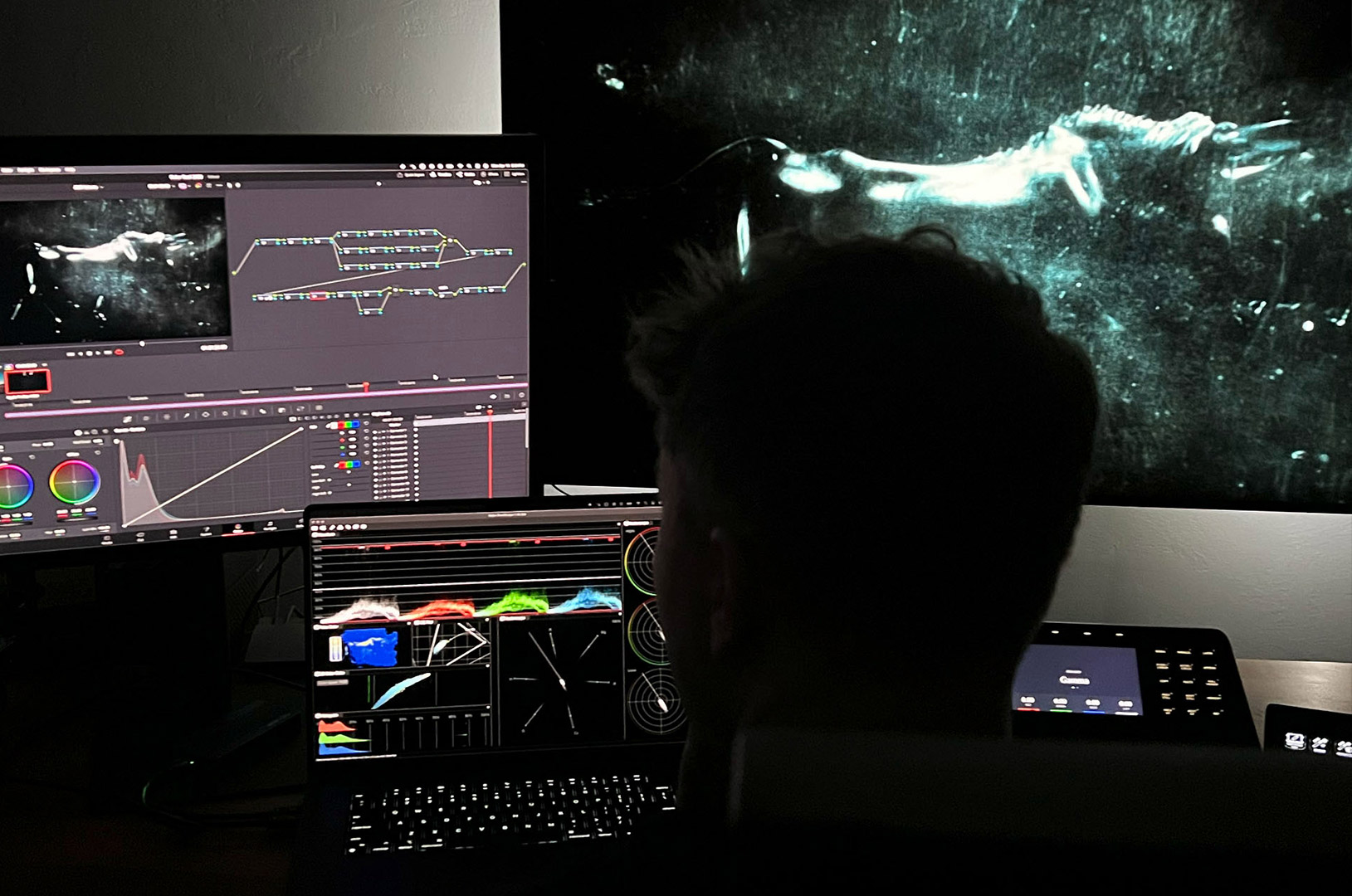
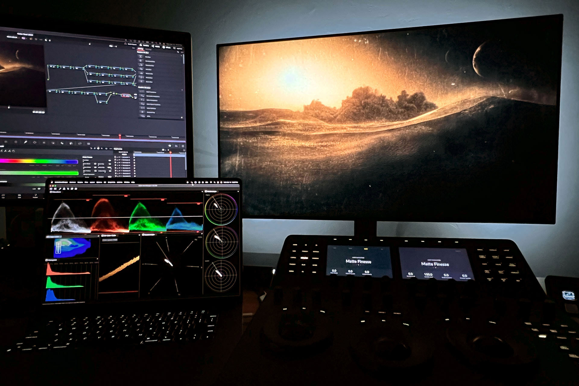
I received a locked edit built from low-res elements, along with a mix of EXR sequences from the 3D team and high-res flat artwork. I rebuilt the timeline in After Effects using the final assets, recreating camera moves from the edit and laying in the titles at final quality."
"From there, I worked to create a sense of light and atmosphere across the sequence—adding pools of light and soft moving shadows to help guide the viewer's eye and, in some cases, introduce a subtle feeling of unease. I also put together and animated the final main title card moment as a 3D After Effects comp.
Once the sequence was assembled and the initial look was in place, I moved everything into Resolve for a full color pass. That's where I brought everything together with a more unified grade—balancing contrast, refining texture, and unifying the palette."
Does the sequence evolve over the season, like in past seasons?
"Aside from the credits updating to reflect different cast members in each episode, the opening itself stays the same. But the way Mark and Katrina craft these pieces, the imagery becomes more meaningful as the season progresses. That's what's so brilliant about them. The visuals don't change, but your understanding of them does. So it feels like the sequence evolves, even though it doesn't."
You also worked on the open credits for Dune: Prophecy. Can you tell us about that?
"The Dune: Prophecy opening for HBO was created by Filmograph, a design and branding studio here in LA. My friend Aaron Becker, one of the principals and the director of Filmograph, reached out to see if I could come on to help with color.
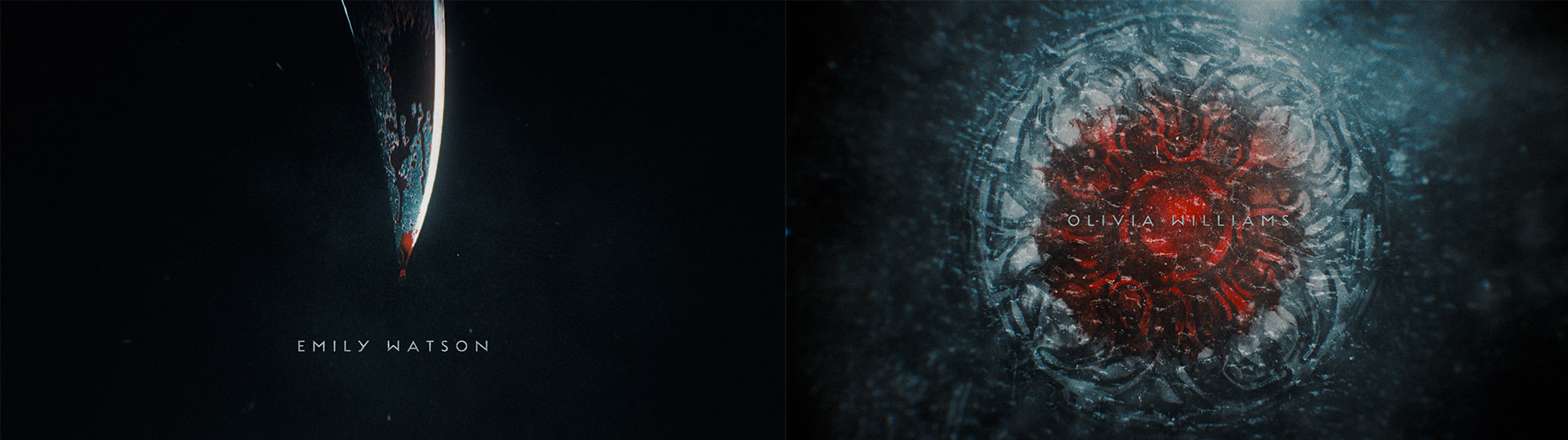
This one followed a more traditional workflow—my role was strictly as the colorist. They had a number of artists animating different scenes, and the goal was to bring more visual unity to the sequence, along with a film print–inspired vibe."
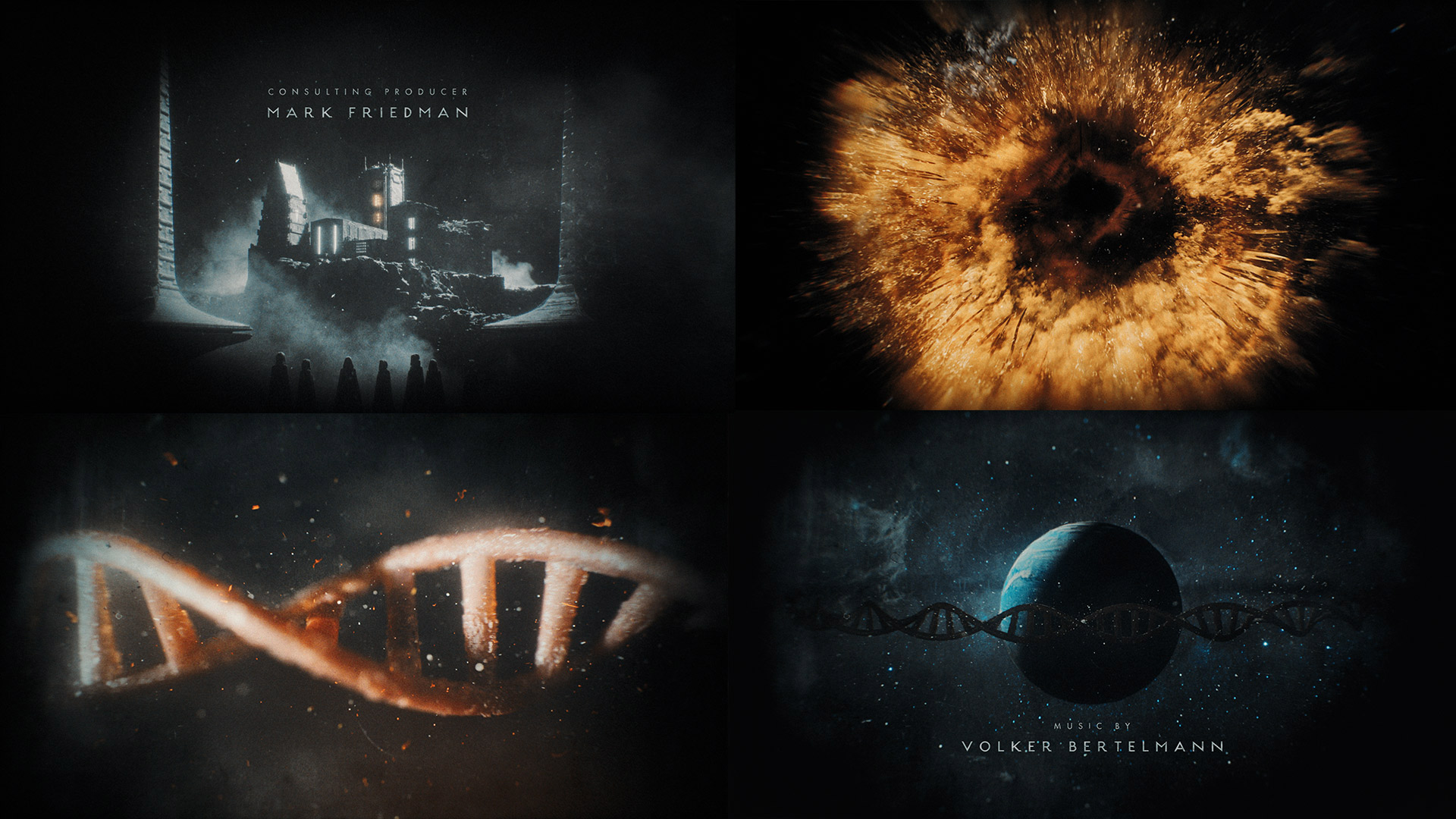
"There was talk of doing a real film-out, though at the time it wasn't clear if the schedule would allow it. So part of my brief was also to look at emulating some of those analog artifacts in case that didn't happen. After the grade, they were able to fit in a real film-out using Fotokem's SHIFT AI (Analog Intermediate) process. The process was overseen by Dave Cole, who was the supervising and lead colorist on the Dune films."
What are your favorite tools in your color suite?
"On the hardware side, my Mini Panel, Stream Deck, and an aging Zowie mouse are where my hands spend most of their time.
On the software side, there's of course OmniScope. I also love Screen player and Lattice, both from Video Village. And not related to color, but I'm trying to go all in on Raycast for navigating the OS."
How did you find out about OmniScope?
"I had used Nobe Color Remap and False Color years before OmniScope came out, so I was already familiar with the company—and had only ever had great experiences with customer support. At the time, I was relying on Resolve's built-in scopes."
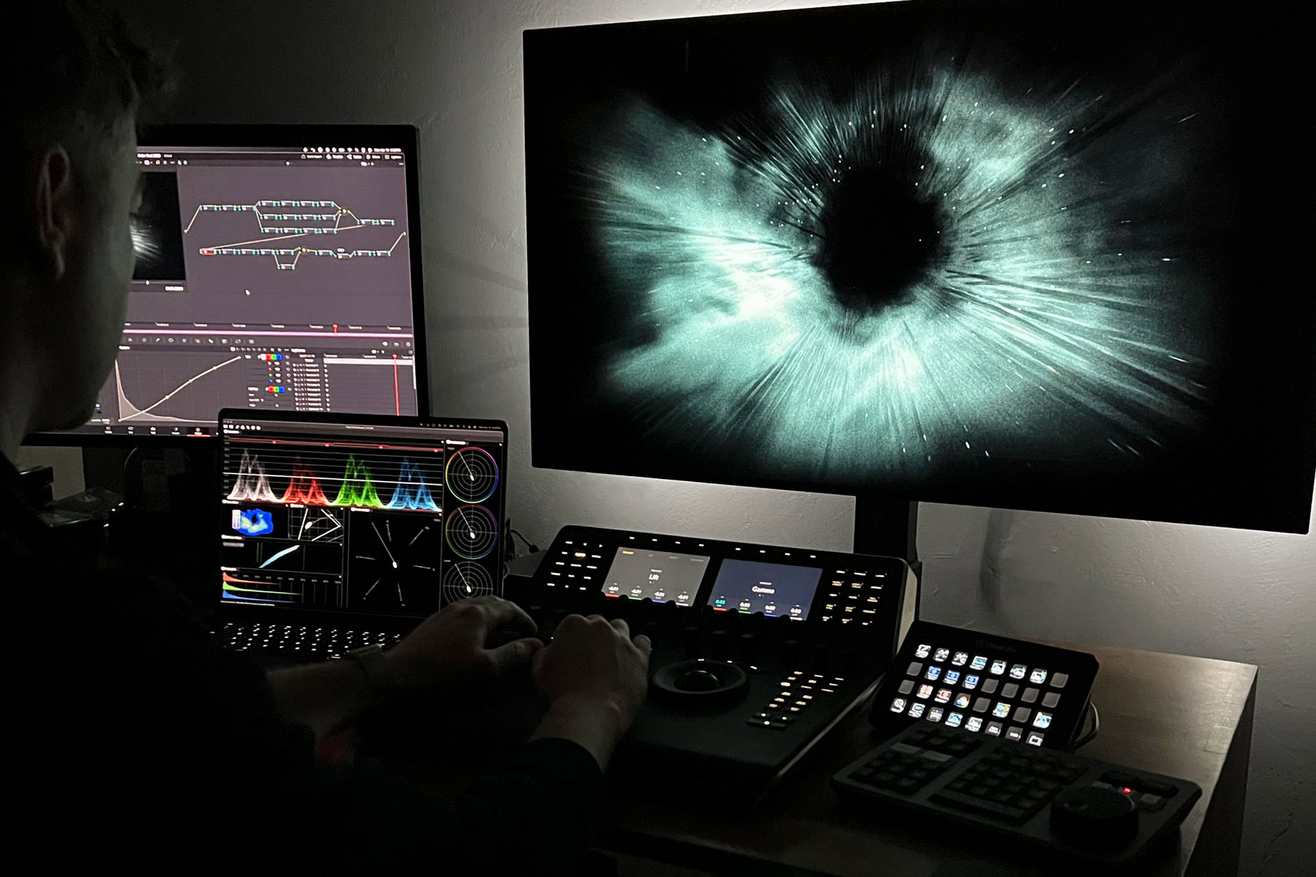
What's your favorite OmniScope feature?
"There's a lot to love, but I think my favorite is the ability to zoom in and out on the split L/M/H vectorscope just by using the scroll wheel. It's such a simple thing, but it makes a big difference—and it's not something you can do in Resolve."
Thanks Jeremy! Lastly, why would you recommend OmniScope to other colorists?
"Nobe OmniScope is fast, looks great, and is incredibly easy to customize. But what really sets it apart is the open line of communication with users and the steady stream of thoughtful updates. Omniscope feels like a tool that's always evolving with the needs of working colorists."